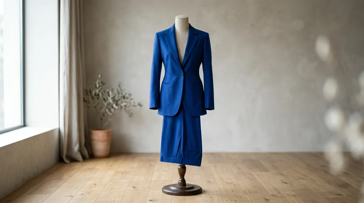
WGSN and Coloro have named Luminous Blue their Colour of the Year for 2027, anchoring a five-shade Spring/Summer 2027 palette the two forecasters announced on April 29, 2025. WGSN senior colour strategist Clare Smith describes the cobalt-leaning hue as having "a dynamic quality," calling it "both mysterious and eccentric," with reach the forecaster expects to run from occasionwear to activewear.
What Is Luminous Blue, And Who Named It?
Luminous Blue (Coloro code 125-28-38) is the joint Colour of the Year 2027 from WGSN, the London-based trend forecaster, and Coloro, its colour-technology partner. The call came out of an 18-member panel spanning London, North America, São Paulo and China, according to WWD's reporting on the announcement.
The decision was framed around commercial range rather than novelty alone. Smith told WWD the shade reads as "quite constant, inspired, vivid and immersive" — language pitched at brands needing a colour that survives translation across categories, from tailoring to swimwear, ahead of the 2027 selling season. John Newton, Coloro's head of colour technology, described the working relationship behind the call as streamlined, noting the WGSN team relies on Coloro's swatch system "to communicate colour with ease."
What Other Colours Round Out The S/S 27 Palette?
Four supporting shades accompany Luminous Blue: Energy Orange (018-57-34), Pop Pink (151-73-22), Meadowland Green (050-61-19) and Clay (014-60-13), per Coloro's own colour library. Coloro's site describes the set as designed to "bridge the past, present and future, embracing the polarities between nature and technology" alongside the Colour of the Year.
The five-colour range spans a warm-cool axis deliberately: an electric blue anchor, a citrus-leaning orange, a saturated pink, a muted green and an earthbound clay. WGSN's release ties that spread to a broader forecasting theme the agency calls interconnectedness — pairing opposites (light and dark, nature and technology, ancient and contemporary) within a single seasonal story rather than resolving them into one dominant mood.
Why Is "Interconnectedness" Driving The Call?
WGSN's reasoning, as laid out in its April 29 release, links the palette to consumer behavior under sustained uncertainty: a pull toward earthy, grounding pigments alongside brighter, joy-signaling ones, and a stated emphasis on slower living and community connection as design references. Smith told WWD the palette blends "traditional in class" aesthetics with "AI advancements," framing Luminous Blue as a hue built for resilience rather than escapism.
That reading positions the 2027 call differently from a pure aesthetic pick. It ties a specific swatch number to a stated cultural thesis — sourced from both WGSN's own release language and Coloro's product description — rather than leaving the hue's meaning to interpretation after the fact. Smith summarized the underlying idea to WWD with a single phrase: "you-can't-have-me-without-the-we," pointing to a season built on interdependence rather than individual statement pieces.
Who Actually Decides A Colour Of The Year?
The 18-member panel WWD described is the forecast's mechanism, not a boardroom vote on aesthetics alone. Members based in London, North America, São Paulo and China feed regional read-ins — retail behavior, runway signal, material development — into a single global call, according to WWD's account of the process. That geographic spread is itself part of the pitch: a colour meant to travel across four continents' worth of buying calendars rather than one regional market's taste.
Newton's framing of the WGSN-Coloro relationship as "streamlined" is a methodology claim as much as a marketing line. WGSN supplies the qualitative narrative — cultural drivers, seasonal themes, named strategist commentary — while Coloro supplies the standardized swatch codes that let a colour move unambiguously from a forecaster's report into a mill's dye lot. Neither function works as a public-facing "colour of the year" without the other.
How Is The Forecast Actually Sold To Brands?
The Colour of the Year isn't just a press headline; it's a product. Coloro sells the S/S 27 palette as individual 10x10cm swatches at $13.95 (€11.95) each, or bundled into a ring-format collection design teams can use for sampling and specification. That packaging is the mechanism by which a forecaster's seasonal thesis becomes a working reference on a design studio's desk, months or years before garments reach a selling floor.
The Spring/Summer 2027 label itself is a horizon marker: the season sits roughly a year and a half beyond this reporting, in the window forecasters typically target so that dye houses, mills and design teams have runway to build a colour into finished product before it ever reaches a rack. Reading a colour-of-the-year call, in other words, means reading a bet on 2027 shopping behavior placed from deep inside 2025.
Does Every Forecaster Read 2027 The Same Way?
Not by design. Smith told WWD that WGSN works exclusively with Coloro on colour calls and does not reference or reconcile its picks against competing systems, such as Pantone's own annual selections. That is a deliberate methodological choice, not an industry consensus: WGSN and Coloro publish one paired forecast, while other agencies run separate processes and may land on different colours for the same season. No single, unified "2027 colour of the year" exists across forecasters — only WGSN and Coloro's version, and it should be credited as such rather than treated as an industry-wide verdict.
Verdict: Luminous Blue is one forecaster pairing's answer to Spring/Summer 2027, backed by a named strategist, a dated release and a sellable swatch system — not a settled industry call, and buyers citing it should credit WGSN and Coloro by name.
For a related trends news perspective, read Briefly about Miami Swim Week 2021 and 24Fashion TV.
For more context, read MARYLING Spring Summer 2022 - MFW 2021.
For more context, read maaji.
For more context, read HOMOLOG SS 2024 during Paris Haute Couture Week.